New site design
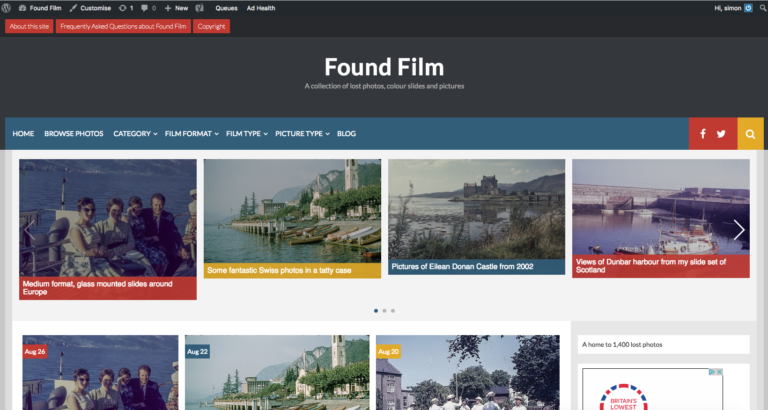
Any regular reader will notice that my photo blog has a different look this morning. Although I don’t like to mess with the layout or theme often, I do review it every year or so to see if I think it would look better using a different layout.
This year however I changed it for a more compelling reason. I discovered using google analytics that nearly 50% of the users are accessing the site using a mobile device rather than conventional desktop machine. Once I discovered this I took a look at the theme I was using and found I hadn’t enabled the mobile view – so I enabled it. I then tried looking at the site on my tablet and phone and found that many of the gallery views were completely broken with the theme I’d used for the last year or so. This was caused by the titles being included under the picture, and any titles longer than a few words were breaking the layout. Since I have galleries in many of my posts I decided it was time for a change.
It took a couple of hours to find a theme I liked which had the features I want. These are:
- I like the front page to be populated with the opening paragraph of the latest posts rather than the whole article.
- I like to use a featured image in my posts and some themes ignore that aspect.
- I wanted the menu to be available on screen at all times in the desktop view rather than being hidden and needing a click to view.
- I need a theme with a good mobile experience (I hate using the word experience – seems too ‘marketing’ oriented but I couldn’t think of another). Obviously the galleries needed to display properly.
- I like a full width layout.
- I wanted a couple of places I could add ‘widgets’ because the theme I have been using only had one and it was becoming a bit cluttered.
In the end I settled for the design you now see which I think is pretty good.
I also took the opportunity to change the vintage camera index to a post rather than a page because that increases it’s search visibility, and to add a links section to the sidebar which has other vintage camera collection sites in. At the moment there are only two others, but I’ll be adding to that as I find other sites with good collections.
Later I’m going to introduce an index for the various lenses I use.

